Example NUSF-1: Constructing Non-Uniform Space Filling maximin designs for a 2-D input space
For this first Non-Uniform Space Filling design example, the goal is to construct a non-uniform space-filling design with 20 runs in a 2-dimensional space based on a regular unconstrained square region populated with a grid of candidate points. The choice of how to construct the candidate set should be based on: a) what is the precision with which each of the inputs can be set in the experiment, and b) timing for generating the designs. Note that the finer the grid that is provided in the candidate set, the longer the search algorithm will take to run for a given number of random starts. In general a finer grid will give better options for the best design, but with diminishing returns after a large number of candidates have already been provided
As noted previously in the Basics section, in addition to specifying the candidate point input combinations, it is also required to supply an additional column of weights. This column will provide the necessary information about which regions of the input space should be emphasized more, and which should be emphasized less. The figure below shows some of the characteristics of the candidate set.
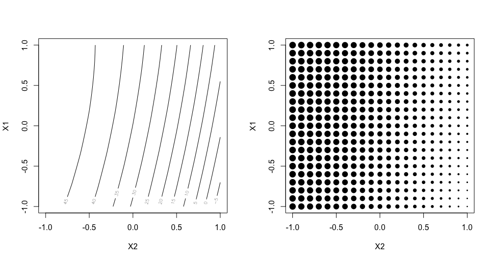
Ex NUSF1 Candidate set of points with their associated weights. Left shows the underlying relationship used to generate the design, and right shows the candidates with the size of the point proportional to the assigned weight.
The candidates are laid out in a regular grid with equal spacing between levels of each of X1 and X2. A contour plot of the weight function that was used to generate the weights is shown on the left side of the plot. The weights range from -14.48 to 50, with the largest values of the weights near the top left corner of the input space. The smallest values lie in the bottom right corner. On the right hand side, we can see a plot where the relative size of the points is proportionate to the size of the weight assigned to that candidate point. This second representation is helpful when the candidate points do not fall on a regular grid, or if the relationship for determining the weights is not smooth.
Here is the process for generating NUSF designs for this problem:
From the FOQUS main screen, click the SDOE button. On the top left side, select Load Existing Set, and select the “NUSFex1.csv” file from examples folder.
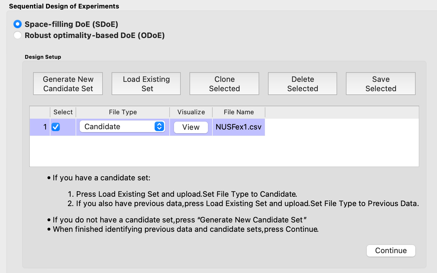
Ex NUSF1 choice of file for candidate set
Next, by selecting View and then Plot it is possible to see the grid of points that will be used as the candidate points. In this case, the range for each of the inputs, X1 and X2, has been chosen to be between -1 and 1.
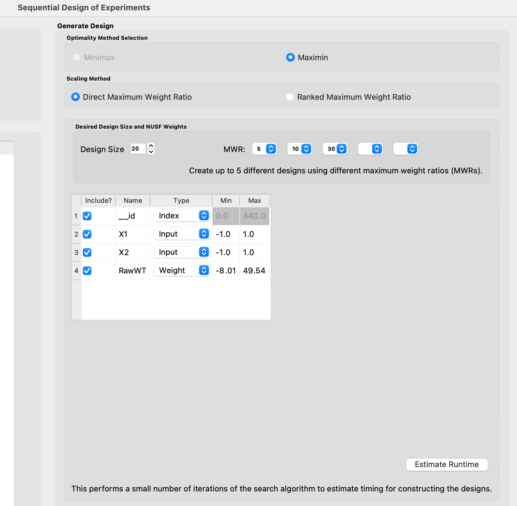
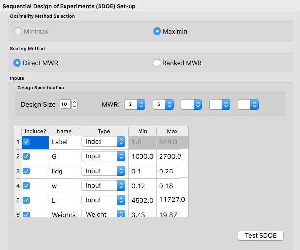
3. Next, click on Continue to advance to the Design Construction Window, and the click on Non-Uniform Space Filling to advance to the second SDOE screen, where particular choices about the design can be made. On the second screen, the first choice for Optimality Method Selection is automatic, since the non-uniform space filling designs only use the Maximin criterion. The next choice is to choose the Scaling Method, where the choices are Direct and Ranked. The default is to use the Direct scaling which translates the weights provided with a linear transformation so that they lie in the range 1 to whatever MWR value is selected below. For this example, we choose the option for Direct scaling.
Ex NUSF1 Choice of settings for generating NUSF designs
Next select the Design size, where here we have decided to construct a design with 20 runs. The choice of the Maximum Weight Ratio or MWR is one of the more difficult choices that the experimenter will need to make, since it is often one that they do not have much experience with. It is for this reason that we recommend constructing several designs with different MWR values and then comparing the results to see which value is best suited for the experiment to be run. Recall that a value of 1 corresponds to a uniform space filling design, while larger values will place increasing concentration of points near the regions with larger weight values. In this case, we select to generate 3 designs, with MWR values of 5, 10 and 30. This should give a good variety of designs to choose from after they have been constructed.
There are also choices for which columns to include in the analysis. Here we use all 4 columns for creating the design, so all Include? boxes remain checked. The __id column is automatically created and we will use it as the index column here. In addition, it is possible to see the range of values for each of the columns in the spreadsheet. Here the two input columns range from -1 to 1, while the “RawWt” column ranges from -8 to 50. The user can change these values if they wish to rescale the ranges to widen or narrow them, but in general these values can be left as is.
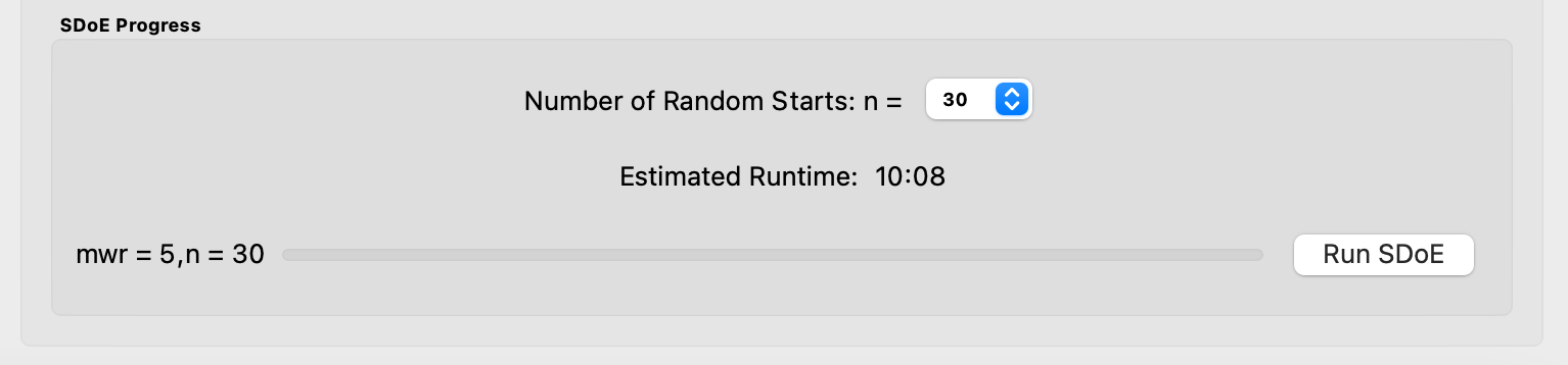
Once the choices for the design have been specified, click on the Estimate Runtime button to estimate the time taken for creating the designs. For the computer on which this example was developed, if we ran 30 random starts, it is estimated that the algorithm would take 10:08 minutes to generate the 3 designs with MWR values of 5, 10, 30. Note that the timing changes linearly, so using 20 random starts would take twice as long as using 10 random starts. Recall that the choice of the number of random starts involves a trade-off between getting the designs created quickly and the quality of the designs. For many applications, we would expect that using at least 30 random starts would produce designs that are of good quality.
Ex NUSF1 specification of timing to generate the requested designs.
Once the algorithm has generated the designs, the left box called Created Designs populates with the 3 designs that we have created. Some of the key choices of the designs are summarized in the columns. The size of the design, the MWR value and the number of random starts are all noted. In addition, the time to create the design is also included. The criterion value is provided. Recall from the discussion in the Basics section, that the criterion value can be compared for designs of the same size and with the same MWR value, but should not be compared across design sizes or across different MWR values.
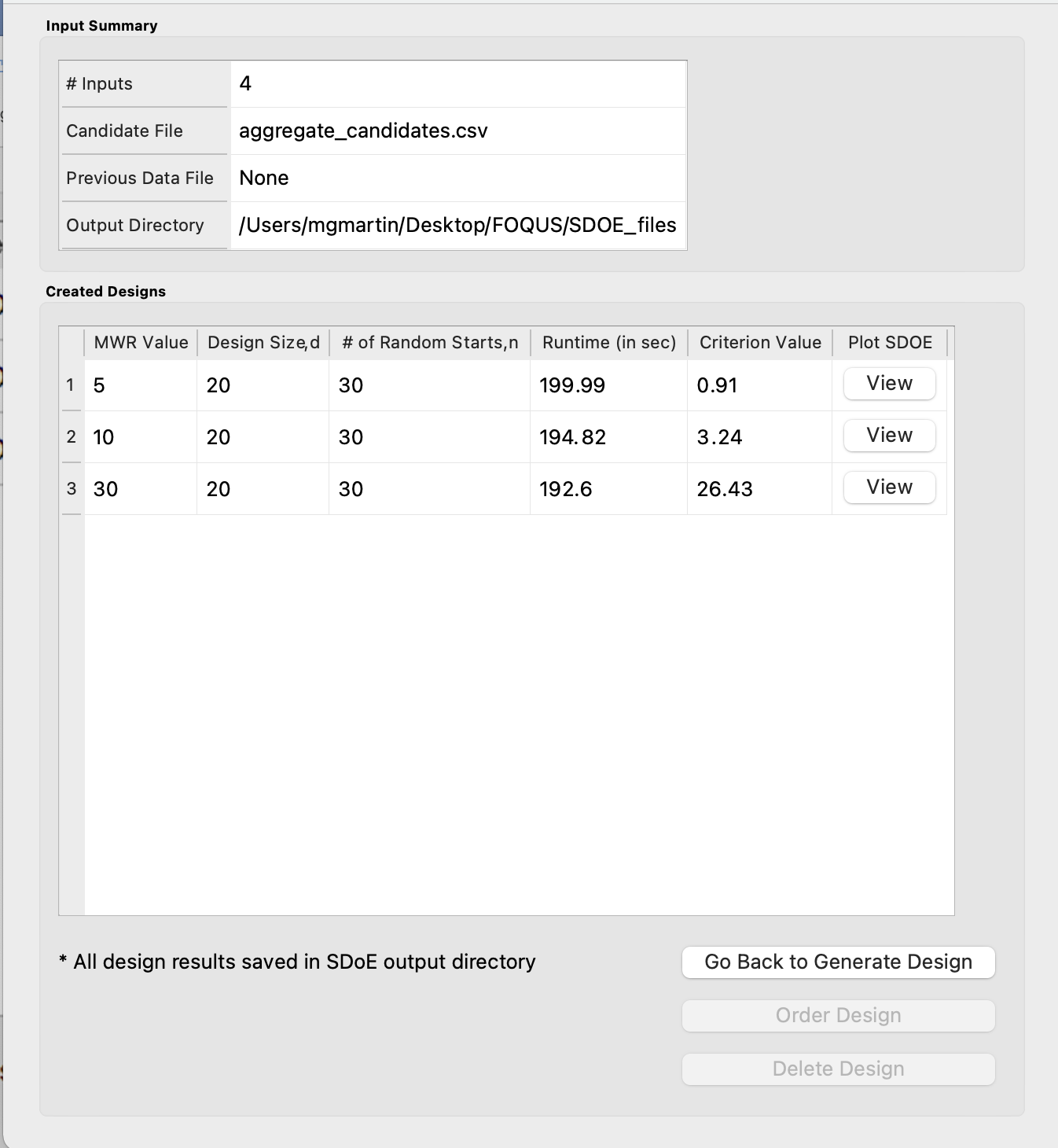
Ex NUSF1 created designs for three MWR values of 5, 10 and 30
To examine each of the created designs, select View and choose the columns to be included, and click Plot. For this example we included all of the columns except the index column __id. Note that two plots are created for each design. The first is the Closest Distance by Weight (CDBW) plot, and the second is the more familiar pairwise scatterplot of the created design.
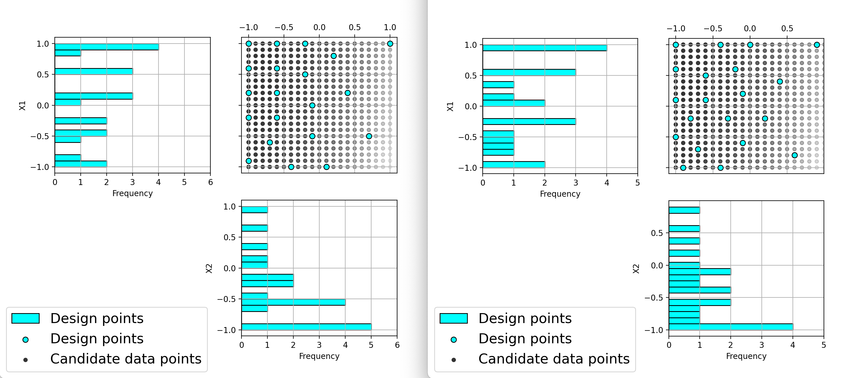
First, we describe the information that is contained in the CDBW plot. There are two portions to the plot. The lower section shows a histogram of the weights in the candidate set. Note that the range of values goes from 1 to the MWR value selected. For the figure below, we are looking at a design created with a MWR value of 5. The shape of the histogram shows what values were available to be selected from. The top portion of the plot, has a vertical line for each of the design points selected (in this case 20 vertical lines for 20 design points). The location of each vertical line shows the weight for the selected design point. In this case, the smallest weight selected had weight around a value of 2, while there are several design points chosen that have weight close to the maximum possible (the MWR value). This allows the user to see how much emphasis was placed on getting the larger weight values into the design.
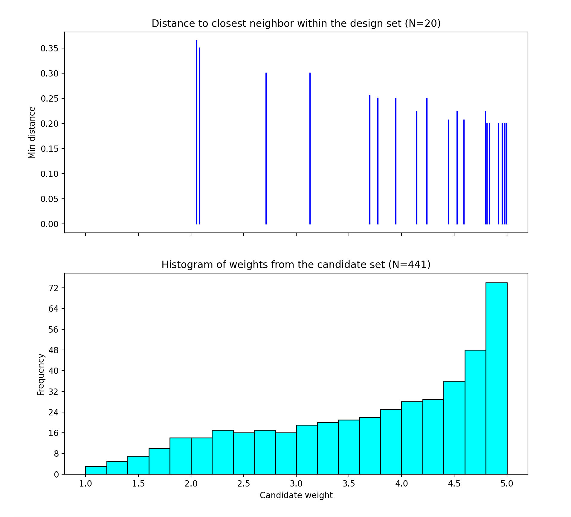
Ex NUSF1 Closest Distance by Weight (CDBW) plot for the constructed design with MWR values of 5
The second plot is the more familiar scatterplot of the design points. It is clear that the non-uniform space filling approach has lived up to its name and has generated a design that has a greater emphasis of points for the larger weights. The design still provides space filling throughout the region, but with very different densities of points for the various regions.
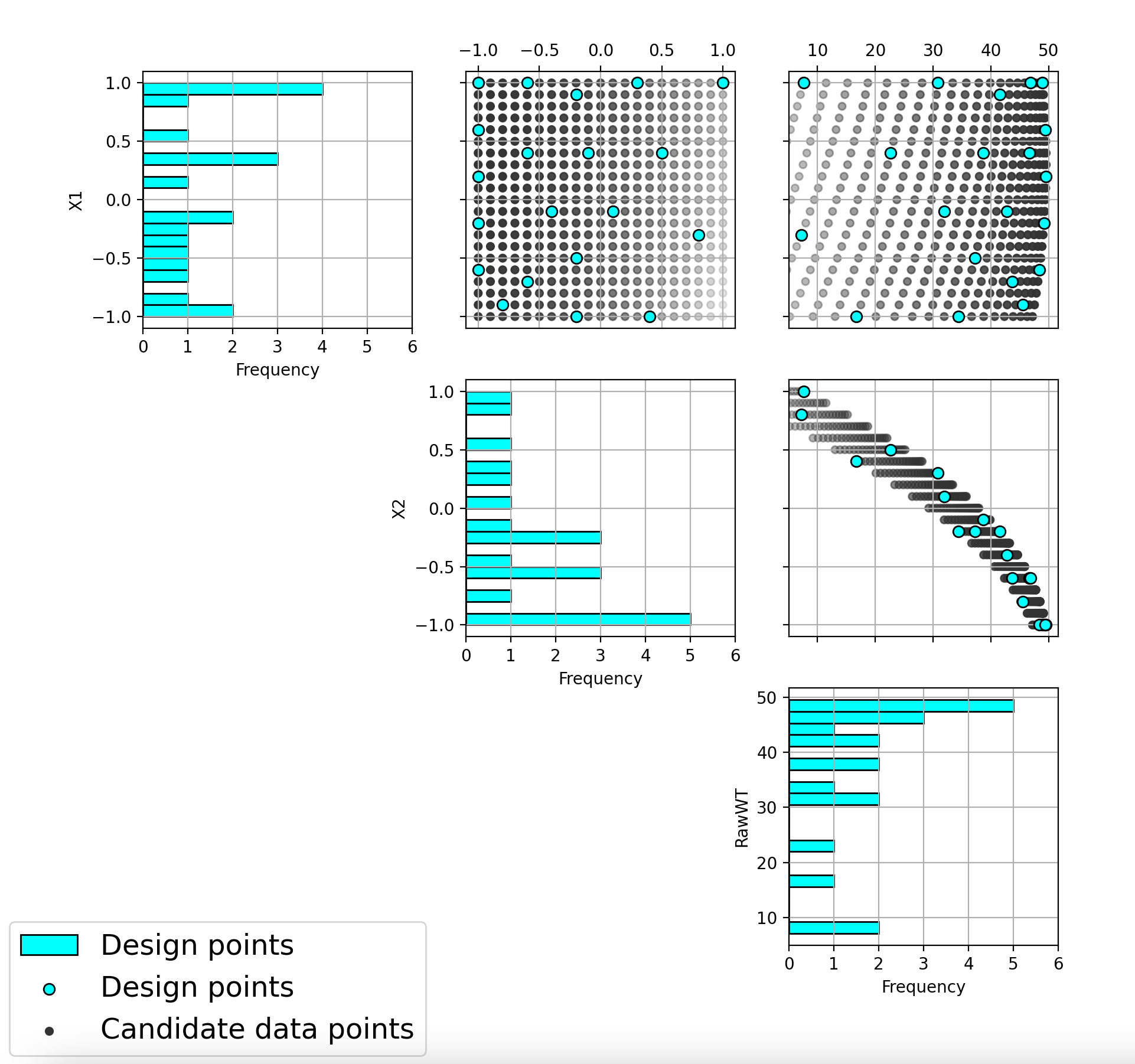
Ex NUSF1 pairwise scatterplot for the constructed design with MWR values of 5
The next step is to repeat the process for the other two designs created. In this case we can see that the NUSF designs for MWR values of 10 and 30 create even more concentrated designs in the region with higher weights. The figure below shows the collection of the CDBW plot for MWR values of 10 and 30.
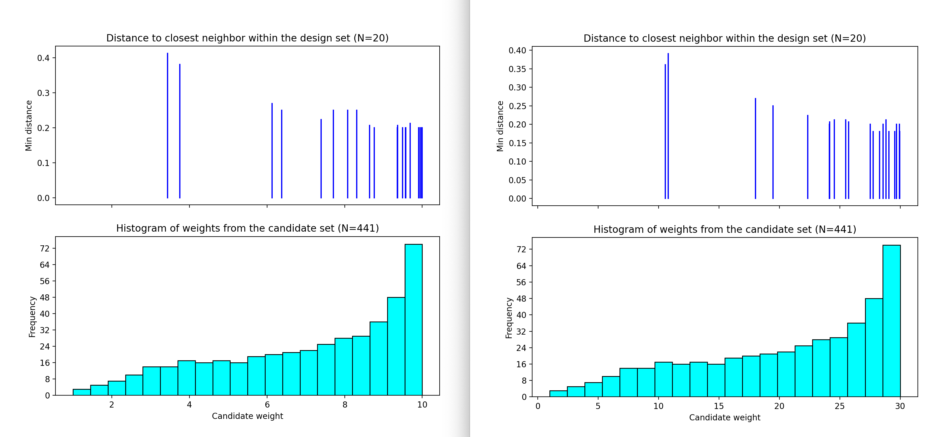
Ex NUSF1 Closest Distance by Weight (CDBW) plot for the constructed designs with MWR values of 10 and 30
When we compare the three CDBW plots for the designs with MWR of 5, 10 and 30, we see that more of the points are shifted to the right closer to the maximum weight value as we increase the MWR value. This gives control to the user to adjust the relative density of points for different weights.
Ex NUSF1 pairwise scatterplot for the constructed designs with MWR values of 10 and 30
When we compare the three designs, we can see that increasing the MWR produces a design that moves more of the points closer to the higher weight regions of the input space. This gives the user the control that is needed to create a customized design that matches the desired concentration of points in the regions where they are desired. After examining the different summary plots for the three designs, the user can choose the plot that is the best match to their experimental needs.
Example NUSF-2: Constructing Non-Uniform Space Filling for a 4-Input Carbon Capture example
For this second Non-Uniform Space Filling design example, we consider a carbon capture example with 4 inputs (G, lldg, w, L). In this case the experimenter is interested in constructing a 10 run design that is space filling, but also places a slightly higher emphasis in the region that is expected to contain the optimum of the process. The experimenter’s team of experts identify that the most likely location for that optimum is located a G=2200, lldg=0.2, w=0.15 and L=8000. As such they construct a set of weights that are highest at this location in the input space, and then taper away the further the inputs are from that optimum. The figure below shows the set of 526 candidate points that take into account the constraints in the region, where running an experiment at those locations would not yield a desirable outcome or perhaps would not even generate any response. The red triangle indicates the identified likely optimum for all pairwise scatterplots above the diagonal. The size of the symbols is scaled to be proportional to the weights at each location, with largest points near the optimum and tapering away as we move to the extremes of the input space.
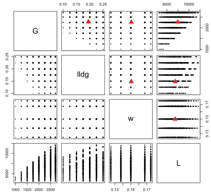
Example NUSF2 pairwise scatterplot of the candidate set with the anticipated optimum location shown with red triangles
Here is the process for generating NUSF designs for this problem:
From the FOQUS main screen, click the SDOE button. On the top left side, select Load from File, and select the “CCSIex.csv” file from examples folder.
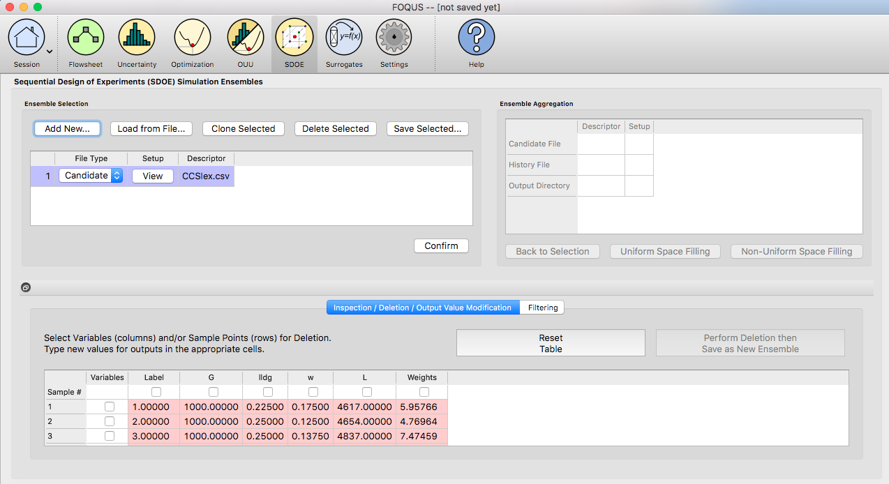
Example NUSF2 choice of file for candidate set
Next, by selecting View and then Plot it is possible to see the pairwise scatterplot of all of candidate points. Note that in this file there are 6 columns - the Label column will be used to identify which of the candidates are selected in the constructed designs. The Weights column summarizes how desirable a candidate point is by its proximity to the anticipated optimum location.
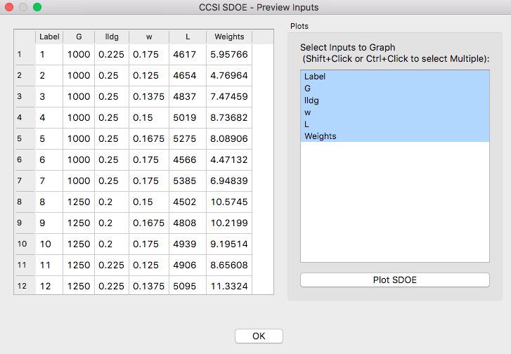
Example NUSF2 top of file with candidate points
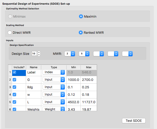
Next, click on Confirm to advance to the Ensemble Aggregation Window, and the click on Non-Uniform Space Filling to advance to the second SDOE screen, where particular choices about the design can be made. On the second screen, the first choice for Optimality Method Selection is automatic, since the non-uniform space filling designs only use the Maximin criterion.
The next choice is to choose the Scaling Method, where the choices are Direct and Ranked. The default is to use the Direct scaling which translates the weights provided with a linear transformation so that they lie in the range 1 to whatever MWR value is selected below. For this example, we will explore what difference the choice of the scaling method makes on the resulting designs, but be begin by choosing the option for Direct scaling.
Ex NUSF2 Choice of settings for generating NUSF designs
Next select the Design size, where here we have decided to construct a design with 10 runs. The choice of the Maximum Weight Ratio or MWR for this example reflects that we wish to have a design that is still space filling throughout the input region, but with a slightly emphasized concentration near the anticipated optimum. Hence we will select small values that are not too far away from 1 (which represents a uniform space filling design). Because, it is not always easy to judge the impact of the choice of MWR value, we recommend constructing several designs with different MWR values and then comparing the results to see which value is best suited for the experiment to be run. In this case, we select to generate 2 designs, with MWR values of 2 and 5. This should provide some variety of designs to choose from after they have been constructed.
Once the choices for the design have been specified, click on the Test SDOE button to estimate the time taken for creating the designs. For the computer on which this example was developed, if we ran 30 random starts, it is estimated that the algorithm would take 15:08 minutes to generate the 2 designs with MWR values of 2 and 5. Note that the timing changes linearly, so using 40 random starts would take twice as long as using 20 random starts. Recall that the choice of the number of random starts involves a trade-off between getting the designs created quickly and the quality of the designs. For many applications, we would expect that using at lest 30 random starts would produce designs that are of sufficient quality.
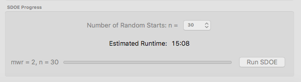
Ex NUSF2 specification of timing to generate the requested designs.
Once the algorithm has generated the designs, the left box called Created Designs populates with the 2 designs that we have created. Some of the key choices made by the experimenter for the designs are summarized in the columns. The size of the design, the MWR value and the number of random starts are all noted. In addition, the time to create the design is also included. The criterion value is provided. Recall from the discussion in the Basics section, that the criterion value can be compared for designs of the same size and with the same MWR value, but should not be compared across design sizes or across different MWR values.
To examine each of the created designs, select View and choose the columns to be included, and click Plot. For this example we included only the 4 input columns to keep each plot to a moderate size. Note that two plots are created for each design. The first is the Closest Distance by Weight (CDBW) plot, and the second is the more familiar pairwise scatterplot of the created design.
Recall that there are two portions to the CDBW plot. The lower section shows a histogram of the weights in the candidate set. Note that the range of values goes from 1 to the MWR value selected. For the figure below, we are looking at a design created with a MWR value of 2. The shape of the histogram shows what values were available to be selected from. The top portion of the plot, has a vertical line for each of the design points selected (in this case 10 vertical lines for 10 design points). The location of each vertical line shows the weight for the selected design point. This allows the user to see how much emphasis was placed on getting the larger weight values into the design.
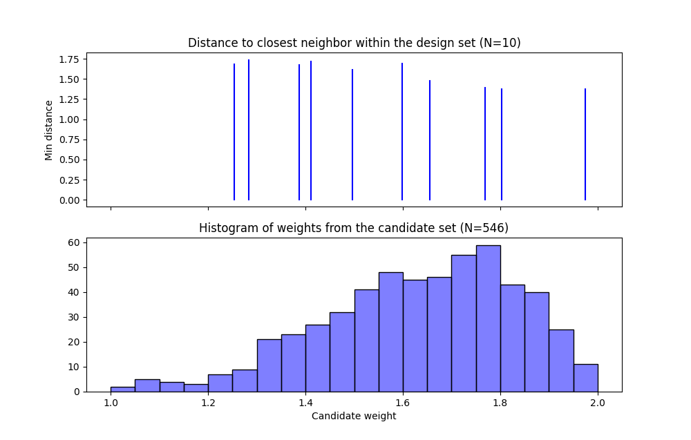
Ex NUSF2 Closest Distance by Weight (CDBW) plot for the constructed 10 run design with MWR values of 2
In looking at the location of the vertical lines in the top of the CDBW plot, we see that some locations in the input space have been chosen across the majority of the range of the weight values. This reflects the relatively small MWR of 2 value that was selected.
The second plot is the more familiar scatterplot of the design points. This shows the location of the 10 selected design points in the 4 dimensional input space. The points look to cover much the same region as the overall candidate points, but with a slight concentration of points closer to the anticipated optimum.
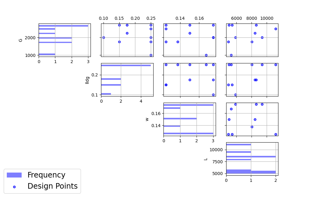
Ex NUSF2 pairwise scatterplot for the constructed 10 run design with MWR values of 2
Next we consider, reproducing the same designs, but now selecting the Ranked scaling option to see how this changes the results of the constructed design. We repeat the early steps for the SDoE module with the same file for the candidate set, “CCSIex.csv”, and all of the choices for the design the same, except this time we choose the Scaling Method, as Ranked.
Ex NUSF2 Choice of settings for generating NUSF designs with Ranked for the Scaline Method
We again construct designs with MWR values of 2 and 5. The time required to generate these designs will be approximately the same as for the other choice of scaling method.
To compare the designs, we can examine the CDBW plots for all 4 of the constructed designs. The figure below shows the CDBW plots for all 4 designs.
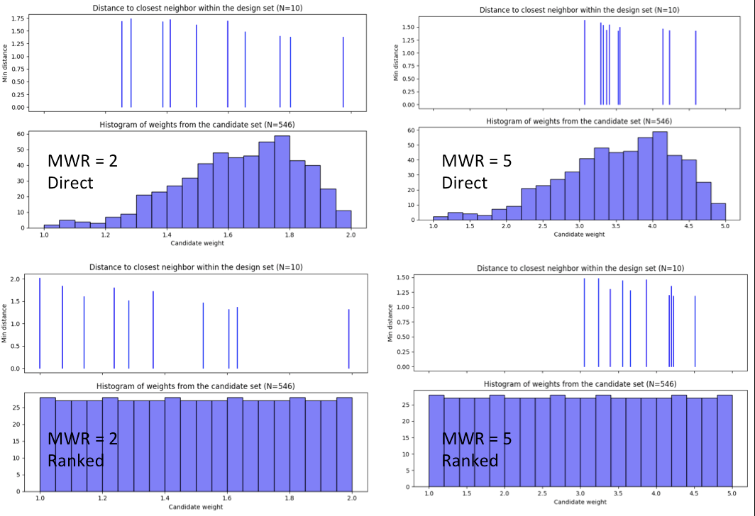
Ex NUSF2 Comparison of the CDBW plots for designs with MWR values of 2 and 5 with both Direct and Ranked scaling
To understand the differences between the choices, we note the following points. (a) Not that for the top row of CDBW plots for those associated with the Direct scaling, the shape of the histograms for the candidate set are the same as for the original unscaled weights provided in the candidate set. In this case, we have a skewed distribution with very few small weights. (b) In contrast, the bottom row of CDBW plots are for the Ranked scaling, and the shape of the histogram is quite different from what was obtained with the Direct weighting. As is typical of the the Ranked scaling, we obtain an even histogram with nearly the same count in each bar. (c) Next when we compare the left (MWR=2) and right (MWR=5) plots, we see that the left plots have a more evenly spread set of weights selected across the entire range of values. For the MWR=5 plots, we see that there is a greater concentration of larger weights that have been selected. (d) To select the design that is best suited for the goal of the experiment, it is helpful to think about how non-uniform the spread of points should be, and how big are the gaps where no runs will be collected. The 4 sets of pairwise scatterplots can helpful to see where the gaps exist. The scatterplots are slightly harder to interpret as the number of factors increases, but the histograms for each input can give a good idea of how the runs are spread across the range of each input.
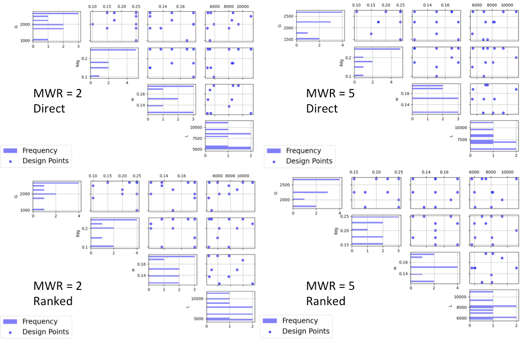
Ex NUSF2 Comparison of the pairwise scatterplots for designs with MWR values of 2 and 5 with both Direct and Ranked scaling